

Goal: Redesign the website of my hometown school county, Charlotte-Mecklenburg. The site is a great platform to provide both school system-wide and school-specific information seamlessly. Here, I will redesign the site to be more intuitive to users by applying principles of design, usability, memorability, and learnability.
Above is the hi-fi redesign of the Charlotte-Meckenburg school county homepage. I chose the fonts and color scheme to be consistent with the logo and image of the CMS school system. I kept the red and used it as an accent color to make headers like the top bar and titles like Recent News stand out. Complimenting the strong red with a cooler blue, I aimed to make the site more relaxing and balanced on the eyes. To draw attention to urgent alerts, I used a color totally inconsistent and jarring with the rest of the style: bright yellow. As for font, I used Sans Serif for big titles like Home in the header and Recent News and Quick Links, matching the logo text (but unbolded) as closely as possible. I complimented it with Gil Sans to add some variety in the link and calendar text. The redesign utilized a grid layout to ensure that the site is responsive across different screens and platforms.
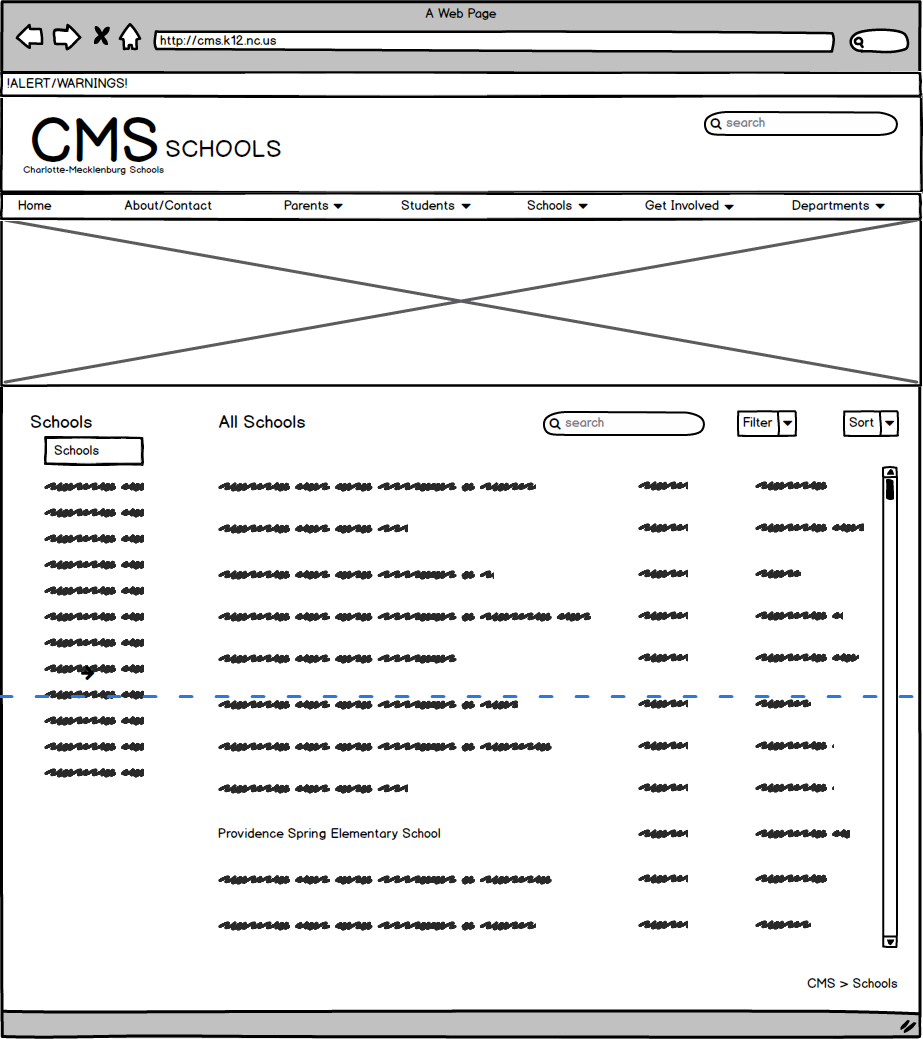
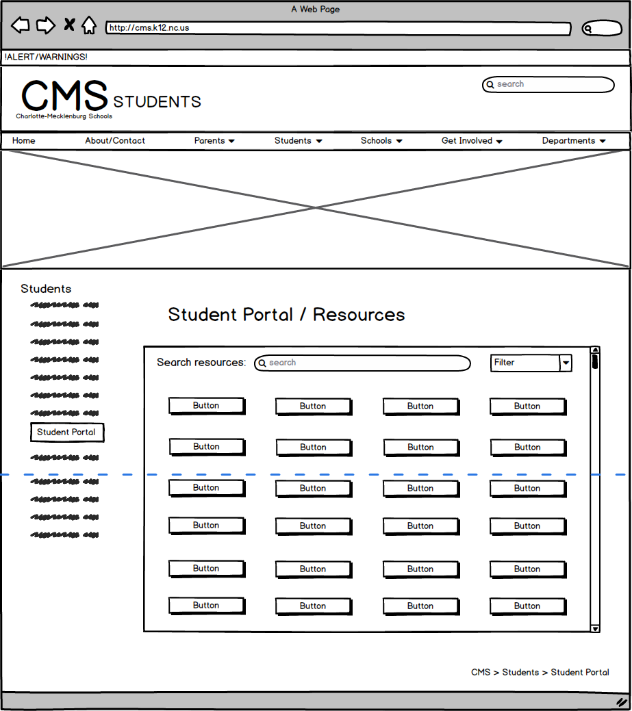
The first step, and most important change, in my redesign was reorganizing the overall structure and flow of the site itself. As seen in the hifi version, I altered the categories and simplified the navigation bar. This change was my first step in the redesign. Below, are the initial wireframes of multiple pages in the site that I created as I thought through creating a smoother, more learnable, and more memorable flow for the site.
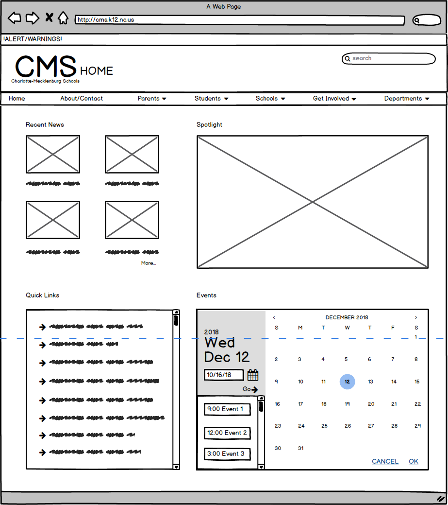
The second step in my process was to mockup the color, content, and exact layout in a hifi prototype. To make the site as usable and accessible as possible to users across multiple devices, I also created the mock-up with grid and resizing annotation to aid coding the actual site redesign.

Finally, I wrote up a usability evaluation of the old and new versions of the site, outlining the aspects I tried to change and how.
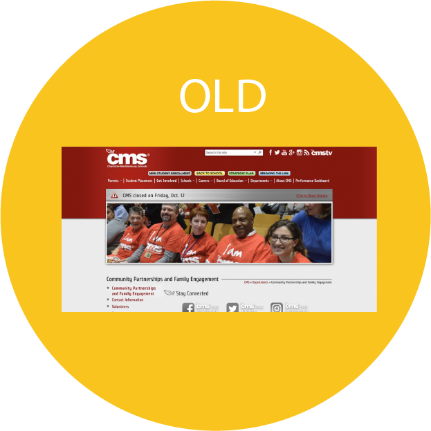
Original Interface |
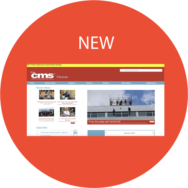
New Interface |
|
|---|---|---|
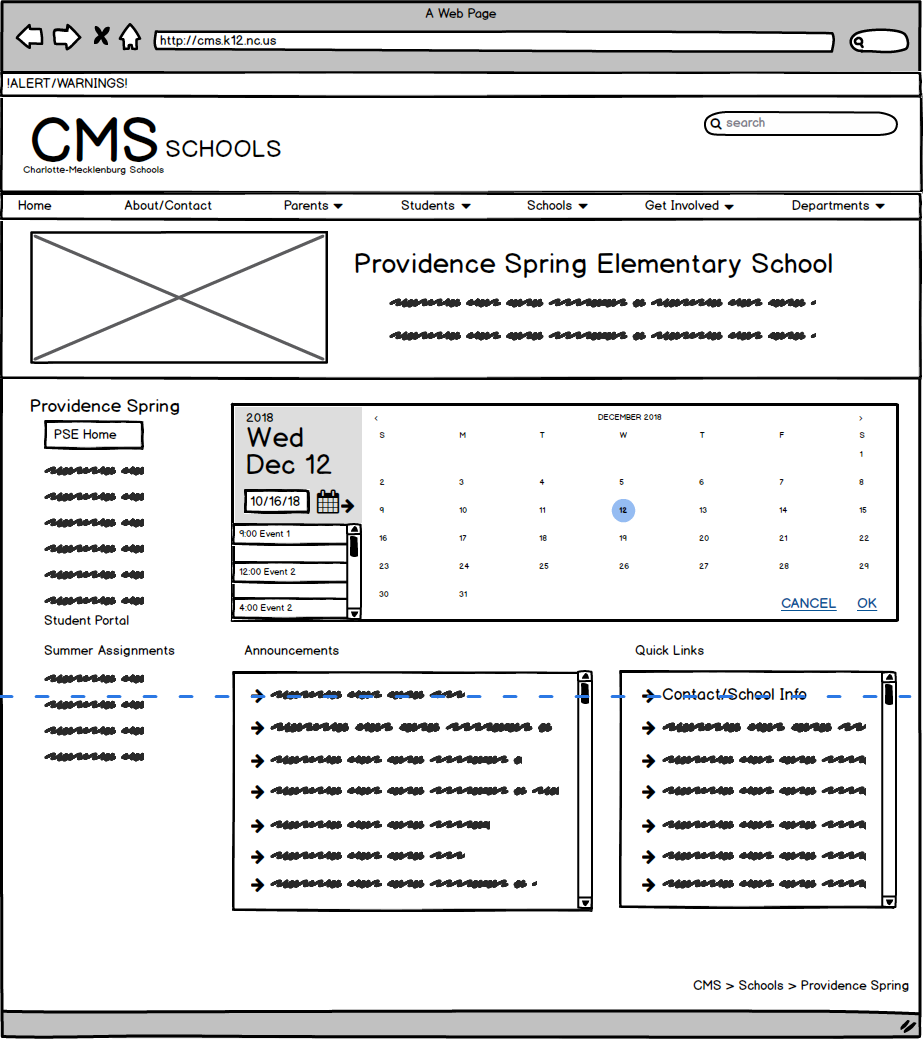
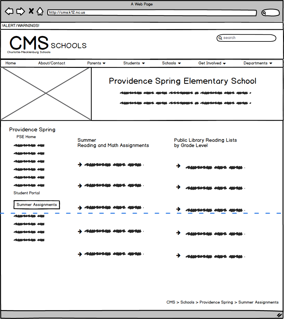
| Intuitive Design | The website does well by keeping the horizontal tab bar constant at the top of all pages. However, this consistency fails when we enter a specific school’s page. Although still housed under the same CMS site, the top tab bar is different, both in style, color, and organization. Perhaps the thought of this was to allow the school page to seem separate, but the page is still hosted under the CMS site, and still has many direct links to the CMS site. The CMS logo is also still in the header, making it’s status and location in the site ambiguous and confusing. Furthermore, the tabs and the page name don’t always match up, which, in conjunction with the fact that the page title is always hidden below a large picture banner, makes status and website architecture very vague. | In my redesign, the school pages have the same top tab bar and CMS header, but have their own banner and logo below, along with their own vertical menu bar on the left. This way, it’s clear you have navigated to a school subset of the larger CMS page, and the user can easily understand and remember how to navigate back to the CMS main pages/tabs. Furthermore, to address the lack of status visibility, the section (a.k.a. corresponding tab at top) is written next to the logo in the header, even for the home page. |
| Ease of Learning | The website does well by including sections for different users (get involved/careers, students, and parents). They also include a small down arrow for tab elements that have a drop-down menu as well, providing good affordability. However, these get lost in the clutter of all the other tabs and quick link buttons which can really confuse the viewer. Likewise, because the tabs are a part of this long continuous red shape that extends behind the picture galleries at the top of each page, they get lost and don’t seem to be their own elements. | In my redesign, the tabs are consolidated from nine tabs to seven, and I added a home tab to make it clear how to get back to the landing page (instead of making users discover that you can click the logo). The quick links become a section on the home page instead and can also be reached in the dropdowns. Additionally, the vertical tab bar and CMS header are designed to be separate elements that sit above and separate from the page content, drawing attention to it and allowing users to see it more easily. |
| Efficiency of Use | The website features a search bar in the header, allowing for a quick search to find what you need. However, it gets lost in the clutter of all the logos and buttons in the header. Also, because there are many pages with a lot of information, like the school page and the student portal page, it’s very inefficient and cumbersome to manually search through these. | In order to make it more visible, I’ve cleared the header of clutter (logos, random quicklinks), giving the search bar more space and emphasis. Also, I implemented scroll bars to hold large amounts of information (like school names/links), along with search, sort, and filter options to allow users to quickly find the name/school/resource they’re looking for (either by category, alphabetical ordering, by specific name, etc.) |
| Memorability | Likewise, although both the CMS and Providence Spring Elementary home page both have an events section, they are styled in very different ways: one is icon based, the other text. This creates poor memorability for the user since there are few repeated elements. | I also made sure to use similar styles for elements with the same function. For example, I used the same calendar and search day format for events on both the CMS and Providence Spring Elementary home pages, this way the user already knows how to use these elements. Similarly, the quick-links boxes are styled in the same way, and the same filter, sort, and search elements are used for large amounts of info. Additionally, I tried making different elements in different styles to differentiate function. For example, the calendar is not displayed through text or icons, but a very visual calendar element. Links are displayed as text with an arrow next to it. And recent news was displayed with a small picture and caption icon format. |
| Error frequency and Severity | The website is mainly informational, so there’s not many very wrong actions the user can take other than navigating to not their intended place. Many pages are only discoverable down very specific links and chains, and it’s easy to get lost and forget how to get somewhere. There is also very poor visibility of system status, thus, making it hard for users to navigate out of where they have come. However, the good thing is it’s always easy for users to escape from going down the wrong path by returning to the CMS home page. This is only achievable by pressing on the CMS logo, which takes a bit of getting used to the website, and is not very discoverable or intuitive. | In order to allow users to recover easily from erroneous actions, there should be a good way to navigate back to the standard pages, a simple organization of pages, and clear visibility of system status–which my redesign does by always keeping tabs to the website’s main sections (Home, about, parents, students, etc.) and putting the current section in the header next to the CMS logo.Additionally, I’ve made sure to organize the website structure more efficiently and including links from multiple pages to the same place, so that there are multiple ways to navigate somewhere instead of one. |