

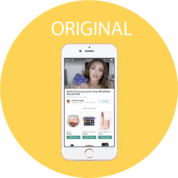
Goal: Design an existing startup's user interface from scratch, without referencing the existing one. We chose the startup ShopWith, whose goal is to let shoppers browse and buy their favorite social media influencer's most-loved products and brands.
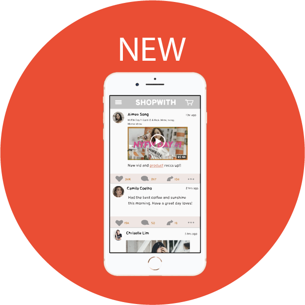
For the project, me and one other team member were in charge of designing the hifi app prototype, from the sketching to the final figma prototype. More specifically, I was responsible for the four lo-fi sketches, and the first half of the hifi figma prototype.
We started off brainstorming four different ways of organizing and presenting the app. The sketches of these are below.
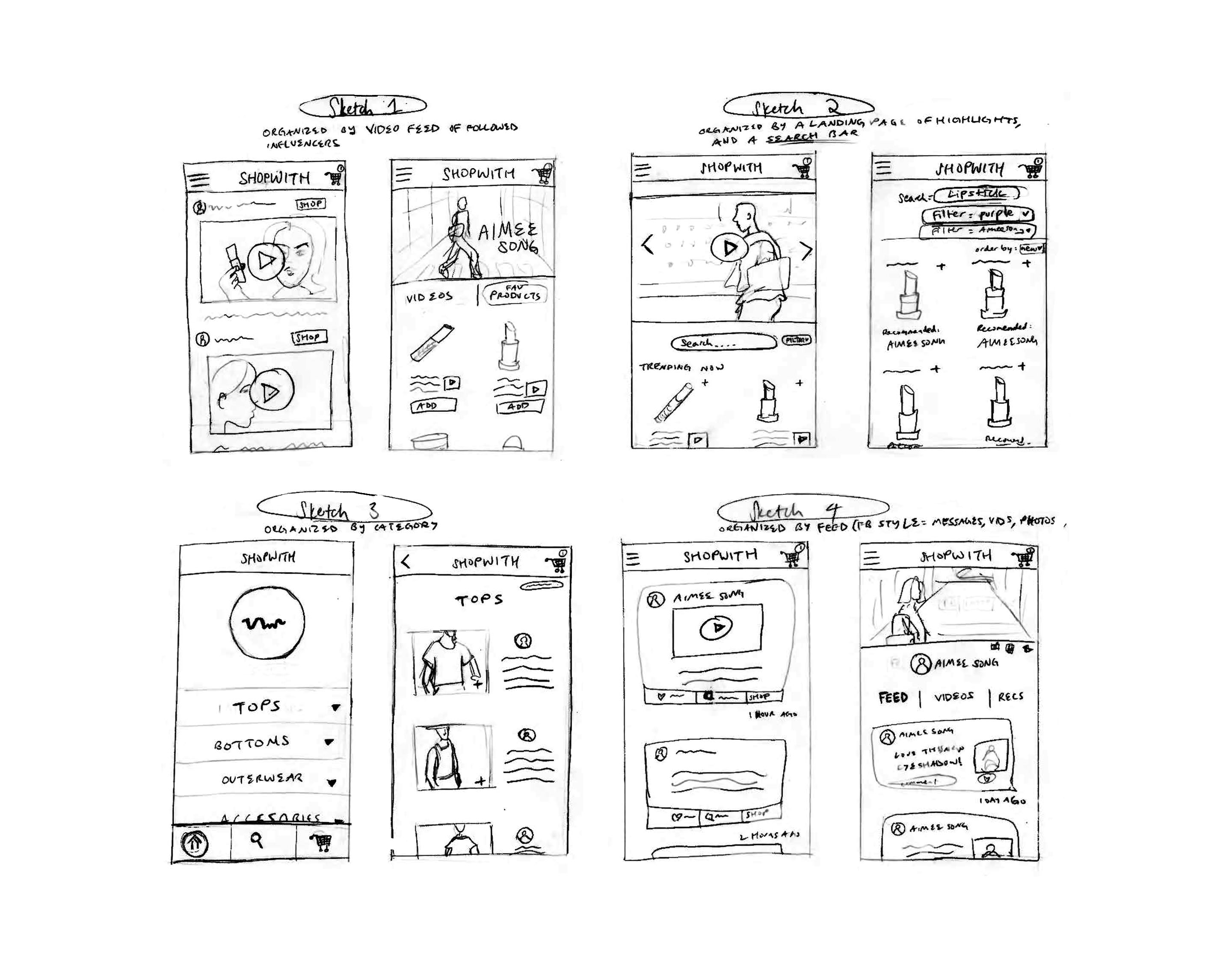
Our four sketches each centralized around a different organizational structure: video feed, a highlights landing page and search bar, and categories of products.
The final, and chosen sketch, is organized around a facebook-style feed which can feature vlogs, tweets, pictures, etc. This design was chosen
for the freedom it allows influencers. They likely have twitter, instagram, and youtube, and such a feed would allow them to connect with fans through all different mediums.
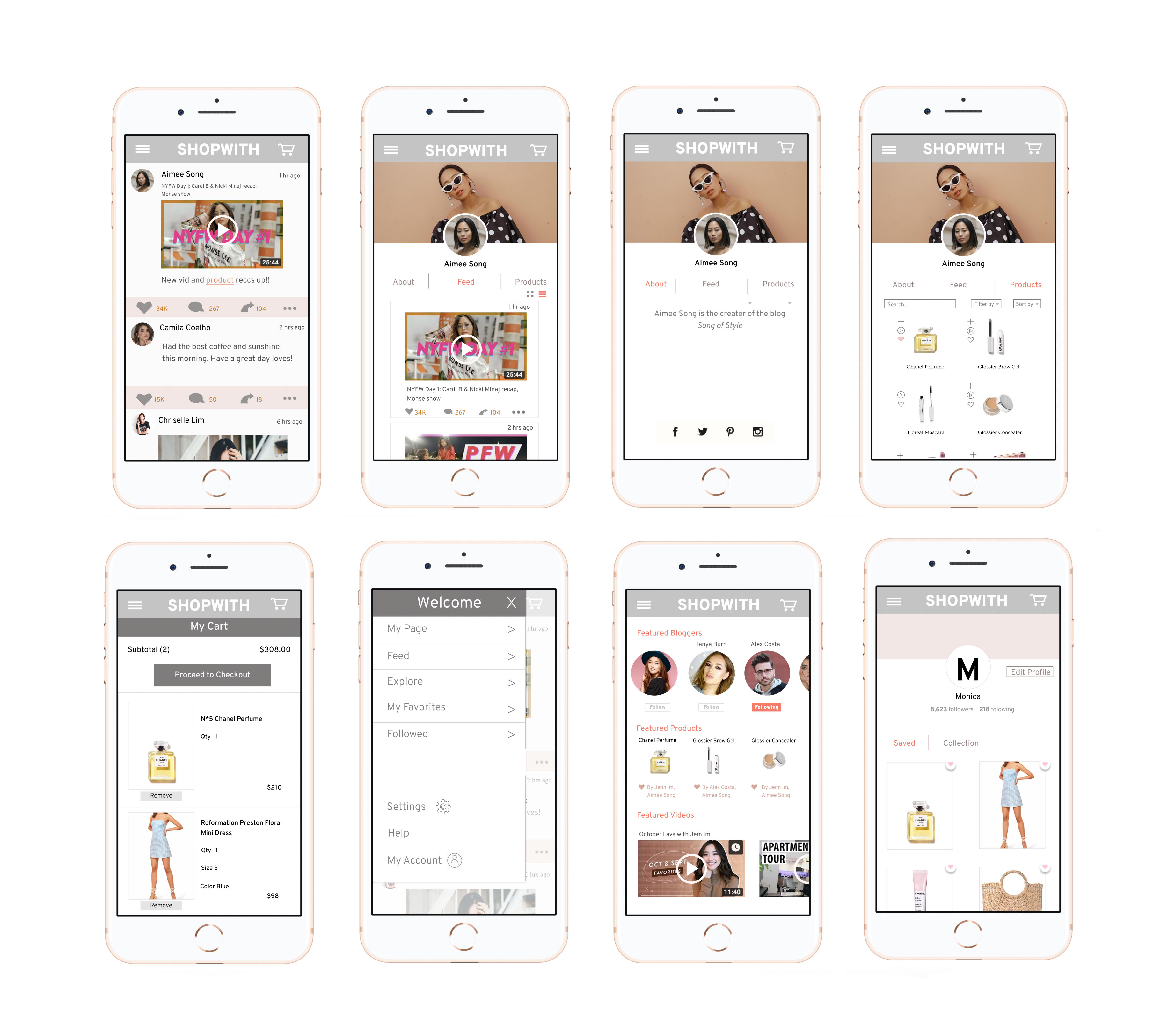
In designing the hi-fi app prototype, we took into heavy consideration learnability, memorability, and efficiency. To make sure it was learnable and memorable, we wanted the structure of the app to be simple, seek, and logical. As a result, we made sure to implement a menu with routes to all the pages.
Following a critique session with other groups, we implemented some changes to our hi-fi prototype based on feedback. The main change was unifying font types across all pages to improve consistency. We also made icons and text sizes larger to improve readability. Finally, we added a back button and an explicit "add to cart" button to allow for better navigation through blogger's products. An "about" page on the blogger's profile was also implemented, including links to the influencer's other social media accounts.
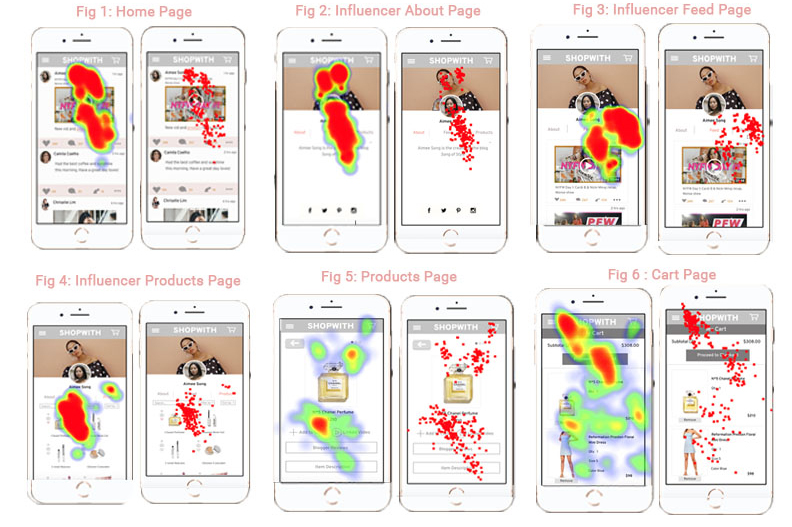
| Home Page | The user was drawn to the content post which was eye-catching with bright colors and a bold font. This was in-line with our original hypothesis, as we believed brightly colored content against a bare minimalist interface background would draw in the user’s attention. |
| Influencer Profile Page | The user's eyes are first drawn to the influencer's profile picture, since it is partitioned with a circle outline, which contrasts with the rest of the interface's rectangular outlines. After her gaze is drawn up to the bold matte colors of the influencer's banner photo, and then moves downwards to the bio. This explains how most of the heatmap is concentrated on the profile picture and the area above and below it. |
| Feed Page | After the user clicks on the feed, she realizes that it is not the correct page to complete her given task (buying the chanel No. 5 perfume), so she immediately searches for a link that will take her to the correct page, which is why most of the heatmap is concentrated around the products button. |
| Influencer's Products Page | Since the Chanel No.5 perfume is the first product and also the one for the given task, most of the heatmap is concentrated around that area. |
| Product Page | We believe there was the most confusion on this page. The user's heatmap is divided between the heart icon on the upper right-hand corner of the product and the add to cart option. This is most likely because there is no intuitive indication to what the heart icon does, and if its function is different from the add to cart button. |
| Cart | The user's heatmap is relatively scattered on this page, since she has completed the task assigned to her and is unsure how to proceed, since no further instructions were given after telling her to add the perfume to her cart. |