

Goal: Propose redesign changes for a Memphis Taxi website using user testing and A/B testing. The main changes I'm testing for the site are, other than a more uniform grid layout for images and test, if the buttons should be red or blue, and if they should say "Learn more" or "Reserve now".
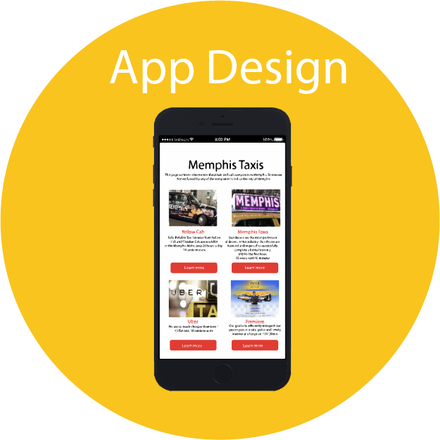
For user testing, I designed the site as an app on a mobile phone with the red button saying "Learn more". I then sent this prototype to users of usertesting.com to get feedback on the effectiveness and/or drawbacks of the design.
Completion Rate |
Error Count |
Time on Task |
|
|---|---|---|---|
| Sub-task 1: Learn about each company | 100% | 0 | 5:46 + 2:53 + 2:30 + = 11:09 / 3 = 3:23 |
| Sub-task 2: Reserve a taxi | 100% | 3 | 1:51 + 1:40 + 2:00 = 5:31 / 3 = 1:50 |
| Sub-task 3: Submit/confirm the reservation | 0% | 3 | 0:00 |
Hypothesis:
It will take users a long time to decide which taxi company to book because I designed my website with the "Learn more" button, and I didn't have a feature telling users the exact price of their trip early on. Instead, only until users actually press reserve can they get an exact estimate. Before this, price information is only available through complicated rates that users may find hard to calculate, causing people to backtrack from the reserve page more.
Result:
The users were able to complete the first two tasks well, but stumbled in 2 main places: realizing reserve and submit were separate subtasks, thus the 0% completion rate for sub-task 3 since users completed this task in sub-task 2. The second main place was predicted: once users discovered that exact estimates could be seen on the reserve page, they re-evaluated and backtracked as a result. This is why the average time on task 2, reserve, was so long (more than a minute). This tells me that exact price estimates for trips should be given much earlier.
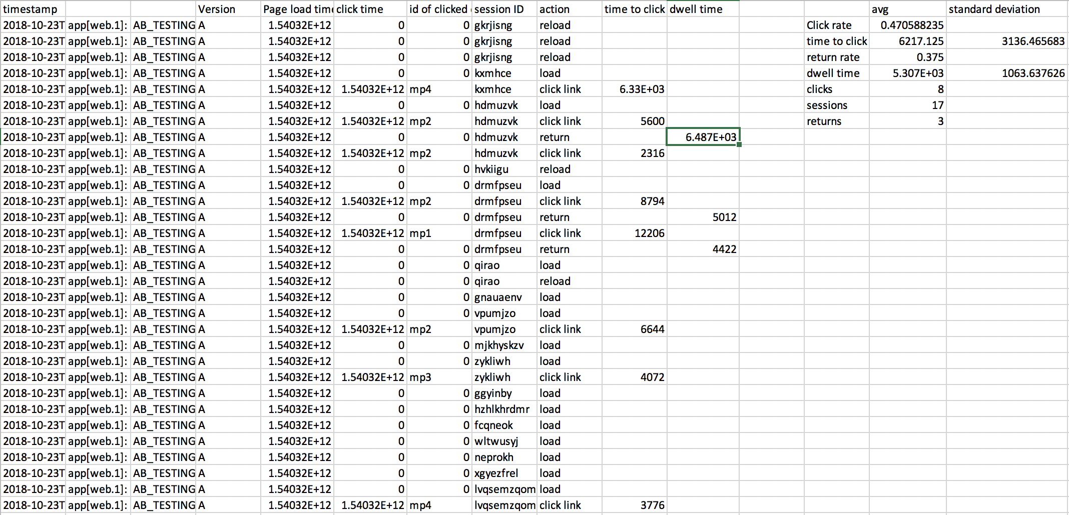
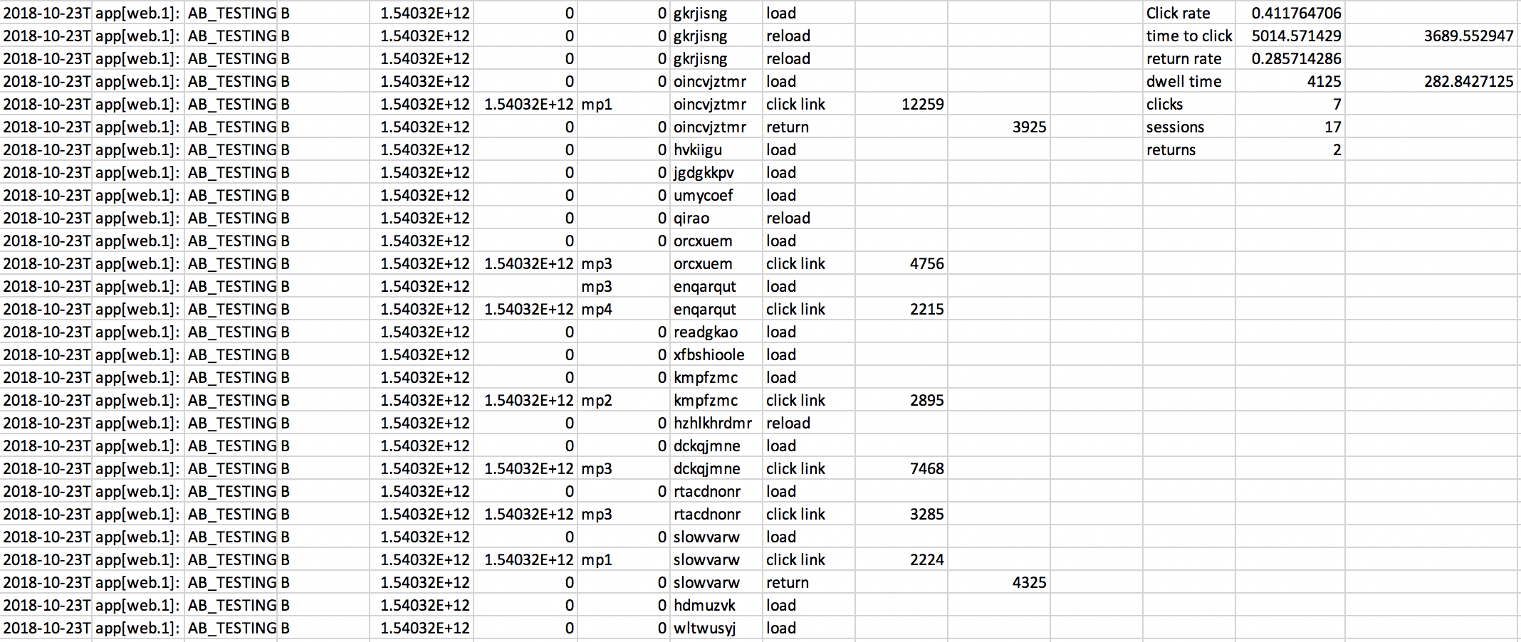
However, I still didn't know if the red "Learn More" button versus a blue "Reserve" button would make any difference to users, so I tested the difference through A/B testing, predicting that there would be a significant difference, with the Learn More causing more clicks (red color), and also a longer dwell time (Learn More encourages users to explore).
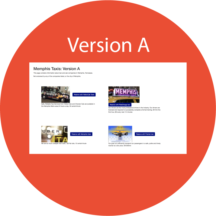
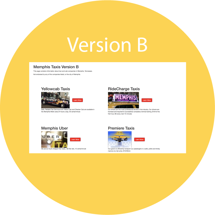
I had a large sample of users click through versions A and B to conduct A/B testing. Version A was reformatted to a grid but maintained a blue button saying "Reserve". Version B had the red button saying "Learn More" instead.
Analysis Summary and Final Conclusions:
The difference between versions A and B were insignificant (as shown in the metrics and p-values calculated), so my proposal to Memphis Taxi would be to focus on changing the information provided on the main page (as pointed out through remote user testing). The website should give estimates of users’ trips on the main page, this way users can compare prices of all four options at the same time. There could be a select trip feature at the top, which will change the estimates for each company accordingly. This way, users can also see the company descriptions next to the prices and can access all the information they need before finally reserving–creating a far more efficient and useful interface.